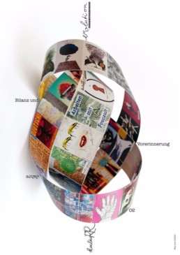
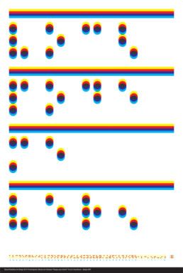
KulturRevolution in Portugal
The exhibition took place at the MUDE (Museum of Design and Fashion) in Lisbon, Portugal.
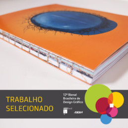
Selected projects for Brazilian biennial
We are honored to announce that some of the projects of Rico Lins + Studio were selected for the 12th Brazilian Biennial of Graphic Design!
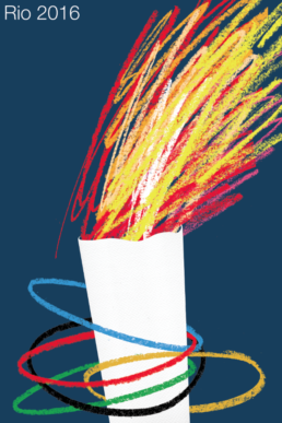
Rio 2016 Poster
Rico Lins produced one of the 15 official posters of Rio 2016 Olympic Games, along with 12 other artists.
The opening of exhibition was on 12 July at the Museum of Tomorrow in Rio.
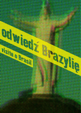
Design Dialogue: Poland Brazil
From June 4th to July 3rd 2016 the exhibition “Design Dialogue: Poland Brazil” brings together historical and contemporary posters from Brazil and Poland at the Museum of Modern Art in Rio. Rico Lins is part of a select group of five Brazilian graphic designers from each country invited to create two posters each one addressing the relationship between the two nations. Curated by Ewa Solarz, Gabriel Patrocínio and Magda Kochanowska and also with the participation of the Muzeum Plakatu Warsaw. Besides these twenty posters, a show of iconic product designs from both countries complete this unprecedented cultural dialogue that will also be shown at the Republic National Museum in Brasilia in November. A special edition of this series of silkscreened posters is available for sale.
The complete list of participants is composed by Rico Lins, Fabio Lopez, Great Circular, Studio Spring, Bruno Porto, Robert Czajka, Małgorzata Gurowska, Marta Ignerska, Dawid Ryski and Tymek Jezierski (posters) and Vzor designers, Furf Design, Agnieszka Bar Jader Almeida, Alicja Patanowska, Holaria, Kosmos Project, Sergio Matos, Zieta Prozessdesign and Sundays Tótora (products).
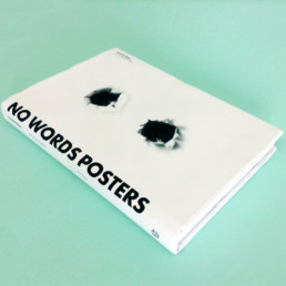
No Words Posters
Rico Lins and about 100 renowned designers were invited to participate in the book No Words Posters Armando Milani, among them Milton Glaser, Stefan Sagmaister, Alain le Quernec, Uwe Loesh, Niklaus Troxler and Isidro Ferrer.
There are posters where there is no shadow of doubt, regardless of verbal messages. For more sophisticated and ambiguous that the image articulation can be — and the mastery of graphic language — inks, shapes and colors take possession of the generous paper surface that receives them, leaving a definitive, irreversible mark.
Always impressed me the ability that the poster has to work with so many issues in synthetic and personal ways, where the artist’s style is not felt as a trap but as something that frees . This reflection confronts us with what I consider one of the main challenges and consequently creative stimuli: the balance between freedom and limits.
I think it is that friction that generates the great energy of the poster and what makes it so universal: to show that with a few notes one can make a symphony.
Rico Lins
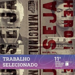
Trabalhos selecionados para Bienal Brasileira de Design Gráfico
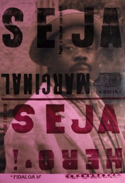
Marginal Heroes and Casa do Saber catalogues were selecteds for Brazilian Biennial of Graphic Design!
Design para todos?
The exhibition brings together twenty posters developed with the theme of the fifth edition of the BrazilianDesign Biennial – Design For All – carrying in its almost homonymous title a provocative question mark precisely to instigate reflection and questioning visitors about its relevance.
To contribute to a healthy diversity of views and visual language, twenty names of different generations and professional market segments were invited Being based in nine states of the country, what they all have in common is – besides the presence of praise in the current Brazilian design scenario, communication and arts – the ability to articulate a critical discourse through a piece, so concise, impactful and now increasingly multiplatform, such as a poster.
The development process of the posters included a Creative Workshop immersion held over three days in September 2014 at Il Bell Resort in Jurerê, Florianópolis, where the posters and the curators were able to discuss the different realities and needs of users of a design project in our contemporary society.
the result is a strong set of communication pieces that incorporates the same plurality evoked in many aspects and recipients of Design for All: to clarify, discomfort or inspire the visitors.
Good reflecting.
Bruno Porto e Rico Lins, Curators
Entrevista a André Stolarski
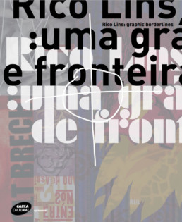
The name Graphic borderlines suggests that your work takes place at some frontier. In a general sense, we could say it’s the frontier of design. However, in your case, with the exception of some works that strive to expand the limits of the language, this frontier is also the limit of design itself as a discipline, where it touches on the plastic arts, music, architecture, photography and so on. If this limit exists and always has it’s because it serves to define design in relation to what design is not. What attempts have you made to set these boundaries and how has your work sought to stretch or dissolve them?
I never ventured to set or draw a limit for what design is or is not. This was never a concern of mine, whether in terms of professional activity, expressive space or my own background. I was drawn to this universe of the image we call design by my interest in communication, on one hand, and visuality, on the other. Both always really attracted me and I discovered by chance that they came together in a discipline known as Visual Communication, taught at a school called ESDI [Escola Superior de Desenho Industrial].
So I enrolled at ESDI and there was something called design, which I started working with. By the time I realized I liked design, it was too late. That’s why this frontier has never been particularly clear or defined, but rather something highly flexible. I like to play around with the inter-contamination of these areas as an exercise. The creative process resides in the binomial liberty and limits. To have a well-defined limit is to have a wall to climb. It’s an exercise in creative freedom, be it with shapes, typography or methodological processes, in which you can achieve an amplitude that’s a little more fun.
So I was never particularly true to design in the traditional, linear sense, despite always espousing communication as a way of meeting a very clear demand, which is a design attitude, though maybe by means not exclusive to the discipline.
Speak a bit about your career path, from ESDI to today.
It was a long path. I graduated in 1979, but I started working before that. Since senior high, before I had any real professional perspective, I was already dealing with visual communication without knowing it. I joined esdi in 76, through Darwin Brandão, my uncle, and Flávio de Aquino, who had just stepped down as director of the school. At the time, you had people like Zuenir Ventura, Aloisio Magalhães and Décio Pignatari on the staff at ESDI . There was a very active circle and a very traditional circle, and it was great to experience these two very different and even antagonistic approaches at such an early stage in the professional formation of design in Brazil. It helped me develop a critical sense in relation to a professional practice not yet fully formatted. I didn’t enroll at the school in order to secure a place on the market, because there was no market back then. I went there to meet an expressive need. My work was tightly bound up with illustration and the image. I was seventeen – youthful rebelliousness in full swing – and ESDI was like a creative laboratory for me.
Interestingly, I felt much more affinity with the Bauhaus than with [The] Ulm [School] and I used to joke that I was much closer to my grandmother than to my mother. Bauhaus represented, and continues to represent, something more similar to what I do, working with borders. It had this root in borders, even historically speaking. At Bauhaus, design dialogued with art, fashion, dance, photography, architecture, poetry – it dialogued with society. Europe was in total effervescence, going through a moment of fantasy and cross-fertilizing ideas – architecture toyed with dance, dance played with photography, photography dabbled in poetry… it was an incredible time.
And after ESDI ?
After graduation I went to France, where I spent six years working with illustration and design. I had left Brazil with solid conceptual and political baggage, considering the reality of a country under dictatorship. In the opposition press, the image made good use of ambiguity; there was content, reflection and a non-decorative power of articulation. In France, I worked for a lot of newspapers, publishers, exhibitions; I had contact with various groups of active and important designers who I’m still in touch with today.
In the beginning, my main interest was in studying. I wanted to go to Barcelona, London, Milan, but I ended up staying in Paris. Then I began to feel it was important to invest in other directions, work a little more with photography. I had the opportunity to go to London because of an exhibition at the Georges Pompidou [Centre] on Alice in Wonderland. That was when I got to know the Royal College of Art and saw that I could go back to school after a good spell of professional work. I won a scholarship and spent two years there, which was really important. At the time, the head of the design department was Gert Dumbar, a very interesting Dutch designer with strong iconoclastic, provocative and imagetic leanings I really identified with. He was very welcoming and said: “Come join us, do whatever you feel like here”.
I started doing animated film, holographics and computer graphics, which was only emerging then. To an extent, I set my own curriculum. I did what interested me. Those two years were a deeper and more mature immersion in the creative and conceptual arena – it reinforced my belief that there can be no good results without concepts and processes. Spontaneous generation and chance can help, but they’re not enough in themselves.
When I left, I was invited to work with Gert in Holland. But I was also curious about New York, where I’d been on vacation and had some brief contact with people who would later become really important to me, like Nigel Holmes, the art director at Time Magazine, and Steven Heller from the New York Times Book Review. Both Steven and Nigel gave me work straight away. I also met Seymour Chwast and Milton Glaser, who were very receptive as well. So I thought: there’s a place to explore here that might bring something to my work – a relationship with the market. There is room for reflection in the market. There’s no need for that old-style view of it, as an enemy of the profession – which was a very 68-ish notion – work as combat. The challenge was to break into the cultural industry. As I’ve always been motivated by challenges, I took this one on too – just parachute straight into New York, but with the same grit as I’d tackled Paris. I started looking people up, making contacts, and was invited to join CBS Records, one of the biggest recording companies in the usa at the time, as art director. This was great, because I started to see how things worked on the other side of the table. At the same time I was also working as a freelancer for other companies, like MTV and other record labels. As I was never on a formal contract I could keep my autonomy. This formal relationship with the market was perhaps another border to cross in my work.
This first year and a half in New York was decisive in dispelling the stereotype that in the USA, because they place such value on specialization, there’s no space for people who’ve never been specialists, whether in style or approach. I was never loyal to a creative process, I never said “I do book covers, posters, trademarks and stuff for TV and will continue to do so for the rest of my life”, but I thought that in the USA someone who does tomato illustration could make a fortune doing tomatoes, but he’ll never do persimmon. But I soon saw that it wasn’t like that; that there were people looking for a more conceptual kind of work, a more transversal way of looking at things, something messier, less disciplined – maybe a little more European.
I had a slightly Brazilian way of looking at things – not in the stereotypical sense, because I’d always made a point of not being a Brazilian who uses national clichés or stereotypes. I found affinities with stuff done in Eastern Europe and other parts of the world, without needing to do macaws or pineapples – though no less Brazilian for that – or having to imitate the international style.
I had some really strong interlocutors, like Jeff Keyton, an important art director at MTV, which was on the rise at the time. I also worked for VH1 and for the children’s channel Nickelodeon. I did some magazine work with Paula Scher, who had just left CBS to open a small studio with another designer before going to Pentagram. There were some really interesting pockets in New York that I started to work with. I did a lot of stuff at the same time and realized that specialization wasn’t important, that is, I saw that it didn’t reside in a style, but in a creative attitude; not in the finished product, but in the work itself, the way you respond to a demand. Maybe that was another frontier: to look at the work as a response rather than as an end product. The process is much more interesting than the result. It’s in the process that things become more consistent.
When I left CBS I continued with my studio for some time. It was a small structure, but very flexible, and I still keep it today. I worked with lots of people from various different areas and a few years later became an agent illustrator for Push Pin and designer for id+A, as well as keeping an image bank with the Japanese firm Photonika. So I created working relationships with clients I would never have landed alone in the US or abroad. I started to discover multimedia too, digital media, the first steps toward interactivity.
Then my life took another turn: I received an invitation to return to Brazil, which I accepted for personal reasons and because I wanted to become involved with a market I knew nothing about here: advertising. I came back and soon felt that the scope was very limited in a market essentially built around the media. Creative work had no effective value and profits were sapped by communication costs. So I watched my hope of doing conceptual work in design go up in smoke. This has changed a little now, fruit of a repositioning in communications worldwide. You don’t have that huge monolithic market with its massive public anymore; everything’s segmented today. The content is worth more now, the communication structures need to rearticulate and design is at the core of this question.
You say that what interests you is not design as an end, but as a process, and that, despite your search for authorial work, the market presents opportunities for interesting communication processes. With that in mind, I’d like you to talk about three of your works in particular: the graphic project for the German magazine Kultur Revolution, a combative and probing cultural magazine; your covers and illustrations for Bravo! magazine, another cultural publication, but one with market insertion; and your covers for Newsweek, which functions at the very nerve centre of North-American capitalism.
Kultur Revolution has an academic readership. It’s my longest-standing collaboration. I’ve been working for them for 27 years, always with the same tone. The first covers are cult now, but at the time they were just something different made for a leftist magazine. The readership was always very clearly defined. And yet, all the other German academic publications back then followed the Germanic school of design, which was my background too: Helvetica fonts in lowercase and left alignment, etc. You had to do something different to get noticed. The target public had a visual culture and was able to understand and articulate images, but the themes were totally arid and I was extremely badly-paid for making those covers. It had disaster written all over it.
The only thing for it was to try to use the space to have fun and produce something that could reach the public in an intelligent way; that would allow me to experiment with visual language and send out oblique and unexpected messages. If it hadn’t been for that, it wouldn’t have gone beyond the first cover. Imagine a briefing given by a German academic. It was a summary. I could never follow those briefings literally. A magazine should have a number of cover designers, but I was the only one. I had to produce various covers and renew the publication with each issue, with different themes, which I had to follow. I used to borrow fonts from German constructivism, I drew inspiration from tango steps in order to talk about the Left or from a collage by Bayer to talk about the presence of Turkish immigrants in Germany. I experimented graphically, but the covers were warmly accepted because the readership was prepared for that sort of thing. In that sense, the communication was very clear. All that resulted in a long-term creative collaboration and a solid friendship.
IThe same held for Bravo!. The difference between them is that the idea behind Bravo! was to work in the cultural area by providing services, and it consolidated its position that way. I started working with Bravo! from the first issue, at a time when it positioned itself as something very different on the market. I collaborated on all the issues, either with an inside cover or some such thing, but I was never worried – or paranoid – about having a recognizable style, though I saw that my work was recognized anyway, without having a hallmark as such, so it was a recognition that came from some other form of expression. This allowed me to use collage to make a cover one day and photography the next, and so on. This gave me a wide circulation and I could maintain the same attitude I had on Kultur Revolution and Newsweek. The difference is that Newsweek was produced for the market, Kultur Revolution was geared toward academia, while Bravo! filled a market niche for services and culture on the Rio-São Paulo circuit.
Newsweek was in accordance with the global market in all its aspects: production, industry, readership and preparation. However, my relationship with the magazine was not particularly different in terms of creation, delivery, process, deadline, the need for communication and results. One particularity of Newsweek is that, given its enormous system of industrial production, the magazine has an art director for each section – three directors just for the cover. There were four editions: the domestic, Latin-American, European and Asian. Two or three covers with alternative themes were created for each edition per week, because one theme could rise or fall depending on the week’s events – not to mention the emergency covers in case something came up at the last minute. It’s a huge volume at a breakneck production pace: the contents are closed on Tuesday to have the magazine ready for Friday.
Even so, I had a very good relationship with the magazine. No-one ever called me up saying “I want you to make a cover like this or like that”, instead it was “I have a problem and I don’t know how to solve it”. So I’d come up with an idea that could become a drawing, a photo or a collage. The end result was always a process ironed out with the magazine. So I signed some covers as illustrator, others as designer and others as art director. Some were never used, or were used much later on. Some came out on the Asian market but not in Europe, others featured in Latin America, but not on the US edition, while others were run everywhere. Producing collages was very complicated, because a whole army of lawyers had to be mobilized to check if there was some chance the owner of an eye or fingertip might recognize his eye or fingertip and sue the magazine for image rights. The industrial production behind it all was insane.
The form and structure of production varies a lot from magazine to magazine, but the solution, the process and the demand, whether it was in conversation with the editor of Kultur Revolution, in the ideas I sent to Bravo! or in the work I did for Newsweek, were always quite similar from the creative point of view.
Let me pick up on your mentioning collage and indiscipline to speak a little more precisely about your work. When you say you felt closer to Bauhaus than to the Ulm School, you also declared your affinity with the 20th-century vanguards. One of the fundamental frontiers in your work lies in the visual arts, more precisely in Surrealism and Dadaism. The idea of indiscipline is common to both. In the case of Surrealism, it’s in plumbing the unconscious, in other words, that which can’t be disciplined. In Dadaism, it’s the iconoclastic questioning of the statute of art. Another procedure common to both is collage. What importance do you give to collage and indiscipline in contemporary design? What scantly explored but powerful resonances can be incorporated into the field to expand its frontiers?
To speak of the image is to speak of ambiguity. Otherwise you lose a major quality of the image. It’s like talking of cooking without mentioning taste or of sensuality without mentioning smell. Prior to understanding the importance of Surrealism or Dadaism as artistic schools in art historiography, and before determining what was one and what was the other, what always interested me was the question of ambiguity in the image that lies at both their roots.
Friction generates energy. This is one of the first laws of fhysics and I think it holds for all types of communication. This is also a basic maxim in our area of work. Collage allows you to associate elements that do not necessarily combine, that remain dissociated. This association generates something that is far more powerful than the sum of the parts. This is evident from our capacity to expand our visual repertoire, through our commitment to pass it on. So, just as a writer has a commitment to preserve written language, we designers have a commitment to preserve visual culture. More than that, it is important that we feed this repertoire with the references that each of us has – and they are innumerable, they come to us down the most diverse paths, and we spend the whole day tripping over them.
If we were a little less elitist – and the eye is not elitist, I mean, we don’t choose what we see – though we do select what we like –; we see what comes before us, the public sees what comes before it – we would see that everything is valid: Marcel Duchamp, Kurt Schwitters or a collage on a kid’s bedroom wall, something painted in the street, a label, all of this is part of the visual universe that permeates us. We are immersed in this. Our job is to edit these images and articulate these signs in order to help create a certain repertoire, establish visual communication. It is on this plane that Surrealism and Dadaism mix, because we are talking about symbols and symbolic language is suggestive. When you de-contextualize something the way these movements did, you shine a light on it. This work is fundamental.
I think it’s great that design is incorporating this. These vanguards are almost a hundred years old and this has long been absorbed by the great designers – in fact, great designers that were considered more illustrators than designers: Cassandre was a great illustrator; Paul Rand, a genius. They weren’t part of a functionalist, Swiss or German school, but they had a dialogue with communication that bordered on art, illustration and advertising. In this sense, perhaps our vision of design is loosening up a little within the Brazilian perspective; maybe we’re managing to talk a little more, shaking off a certain plaster cast. That is not to say that we are losing composure; quite the contrary, we are gaining authority in what we do, we’re beginning to broaden our visual repertoire and incorporate elements that never used to be part of design and weren’t welcome in it.
I’d like you to talk about the relationship between the ideas of function, which has always been a touchstone in modern design, functionalism, and a third, which you seem to defend in your work: functionality..
Interesting – I’ve never really thought about this. Functionality sounds more pragmatic to me, more disposable, perhaps more immediatist. The problem with the modern is that it sees itself as eternal. When you think of a perfect form, you self-invest in a very weighty character of eternity, as if perfection actually existed. It’s an absurd contradiction in Modernism, because it ceases to be modern. Functionalism is very much connected with the modern while function is less bound to a school geared toward the essence of the object. Form, function and application are essential. Things have to have a function. Breathing has a function, air has a function, objects have to have functions.
I never reflected much on the relationship between form and function, but I always doubted that it could resolve all the problems. When you start to see design outside the theory and in practice, as a communication tool, then it begins to exist in the day-to-day, when you’re walking in the streets, bumping into the media and everything that goes with it. The elements are more imponderable, less perfect. The classical form/function relationship presupposes a very perfect balance. It’s like the design of an egg. Everything is perfectly resolved in there. Nobody can mess with it or it topples over. Perhaps functionality is more pragmatic, ephemeral and transitory and so perhaps closer to reality. It is less romantic, stripped of an air of purism, more down to earth.
In mathematics, a function is the direct correspondence between elements. In the world of images, a peculiar type of function is established between images sold by the famous image banks and certain textual or ideological messages. In general, these images serve only to translate messages: they belong less to the field of images than to that of textuality, they are literal or functional illustrations. Your work seems to run counter to this type of relation, as the images are never what they seem. The poster for the 21st São Paulo Biennial and the cover for a special Brazil edition of Big magazine are examples of that. In addition to generating an impact, these images also acquire permanence, as they remain a source of interest and questioning for those who see them. What is the role of this kind of image in the context of contemporary communication?
In a word, inclusion. Communication processes are transforming more and more into information processes. That’s a problem. Information is unilateral and unidirectional, while communication is a bidirectional and inclusive process that presupposes a reply. In this sense, things must never be complete. The perfect is the pits, perfection is absurd. When everything is totally resolved you’re basically signing a certificate of stupidity for the reader, because there is no space left for him. Image banks are made like this. Their stock is so literal it excludes all brain power on the part of the viewer. Everything there is already digested and said. In other words, they are images with no function. That kind of image may work in an advert, on the cover of a company report or as a poster in a laboratory. You can change the image, but the function stays the same. You can sell a car, a bank account or a blood test with that same image. It makes no difference at all. There’s no meaning there. It’s just there as a compositional element.
Even after such a brief period of mass communication or the so-called democratization of means of communication, we’ve managed to destroy the millennial Chinese saying that “a picture is worth a thousand words”. Today, a single word is worth a thousand images. Images are absolutely bereft of all content. We are living a moment in which images need to be re-signified. We have non-stop access to images, but they are becoming emptier and emptier and increasingly more disconnected from their content. If you can’t attribute content to an image, then it doesn’t exist.
When I use the image of a sliced fig on the cover of the Brazil special in Big magazine, I am not using a banana or a woman, but a fruit that, while not necessarily Brazilian, connotes the natural and the erotic when sliced open. When this cover caused a stir and led some newsstands in Los Angeles to refuse to display it because they said it was pornographic, I know that I got my message across. There is a subliminal message in there over which I have no control. People saw something there of their own accord. I didn’t say “This fig has a pornographic meaning”. It’s up to you to see what you want to see in it. That’s where things get interesting, because you are dealing with the interpretive capacity of the viewer, with a public that is not passive, but actually made up of co-authors, of people included in the communication. Perhaps this is a border with music, because when you hear music you can dance. When you see an image and interact with it through a sense of strangeness, something similar is happening.
Now, in the poster for the 21st São Paulo Biennial I used references to the history of art. In fact, it’s a series, a triptych revisiting three male statues from different periods in the history of art. There’s Rodin’s The Thinker, which is the most classical, there’s the Discus Thrower and then there’s Mercury, and I made three posters. I mixed Rodin’s The Thinker with a portrait of Magritte that I love, in which he’s got his face covered with a chessboard. But it actually came out wrong and all the better for it, because I didn’t have much money to produce it and called a photographer friend of mine, who also agreed to do something more experimental. The photos were taken at his house (there was no budget to pay for the photo, or to rent a studio, lighting, none of that). The model was another friend who had just had a plaster cast removed from his leg, so he couldn’t stand there posing on one leg as a classical statue. So we said: “let’s invent some issue here, with the elements we’ve got”. To do that, we had to combine low lighting with photos taken in motor drive, which resulted in a certain asynchrony when the shot was taken, and the shutter was left open as the film ran: due to a photographic “error” and the unusual movement of the image, the negative ended up too long. It was much better and more surprising than the photo that actually “came out right”. These are accidents that end up being incorporated into the work.
Another piece that shows this kind of encounter is the poster for the film Bananas is my Business, where part of Carmen Miranda’s face is replaced with bananas. Instead of a literal reading of the title, we have two characteristics of your work: an iconoclastic persuasion and evident sense of humour related to this type of operation. What is the role of humour and irreverence in communication with the wider public?
The poster is there to be pasted up. Everything has to be considered from the perspective of where it is going to exist. A magazine has to be thought of in a newsstand, a book in a bookstore, a TV show on a television set. This poster was made for the launch of the film colain the USA, where posters are pasted onto boarding in the streets. It was a fictional documentary about a great Brazilian pop-culture legend, a very famous figure. It didn’t make sense to produce a work on Carmen Miranda that showed Carmen Miranda. I had to find another way, because the Carmen Miranda to be pasted onto the wall for this film was new.
I started from this principle: A different Carmen Miranda, pasted on a wall, a pop icon. I took a classic photo of the singer and whitened it out, printed it at five to ten percent so that it was barely visible, almost absent. I reduced Carmen to Carmen’s mouth – because her smile and her voice are just as emblematic as the fruit on her head – and put some Andy Warhol bananas there for eyes, from his Velvet Underground cover, which is a huge icon for me, a synthesis of pop representations of the banana. (I tend to fix on certain things and use them on various occasions, in different works).
This was a way of enlarging the poster, because when they were pasted in a row, the bananas joined up, creating a kind of dance. When you looked at them from a distance, what you saw wasn’t a row of Carmen posters, but a long sequence of bananas and red mouths. Then you had to go up close to see, because the poster didn’t look like a poster, but more like a painted wall or something. I used this device a lot on the cinema posters I made in New York.
That was also the technique for the Pedro Almodóvar film Labirynth of Passions. At the beginning of his career, Almodóvar’s aesthetic was very charged, very kitsch, while I, on the other hand, was discovering the movie posters from Indian cinema. This film, which was made with very little production, was not the Almodóvar we know today. It came out after Women on the Verge of a Nervous Breakdown, which brought him worldwide fame. I wanted to make a poster that had the feel of this film, with an aesthetic that went against the grain of the cinema we had then. I ended up producing a haphazard collage of jumbled elements. You couldn’t quite tell if the posters had just been pasted up on the wall or if they were being torn town so others could be pasted over them. This relationship between the viewer and the poster is very important for its visualization.
Another job I did for cinema in the US was a poster for a movie called Boca del Lobo, a political film from Peru on the armed struggle of the Sendero Luminoso against the Peruvian army – that endless fight in which one was winning one minute, then losing the next; in which each was viscerally bound to the other in trying to resolve a question intrinsic to Peruvian political history. I saw that the poster didn’t have to be vertical, much less have a fixed position, but that it could somehow reflect this up one minute, down the next situation. As well, the political poster is only complete when it’s on the wall outside. There’s no point making a political poster and hanging it on the wall of your house. It’s sometimes much harder to paste a political poster than it is to make one. Making them is even easy sometimes, compared with the guy who has to go paste it up and get truncheoned. That’s why I thought it could be an opportunity to include the person who’s going to do the pasting, leaving it unclear which side is up, giving no clear instructions. This was really good, because people hung them as they liked – sometimes upside down, sometimes the right way up, sometimes one upside down and the other right way up. There was no rule. I think this inclusion is fundamental. It’s nice to be the final author, but if you can understand the final author as a conductor in the process, then things get much more interesting.
You like to say that, contrary to what is normally said of art in the age of technical reproducibility, one of the most defining characteristics of design is not the demise of the original, but the possibility of transforming the scale and proportions of images. For you, more than any other field in culture or the visual arts, design is capable of altering the meaning of images in this way. Why is this an attribute so particular to design?
The change of scale was an opening I found to respond to the challenge posed by the curator Agnaldo Faria when we started thinking about the project for this exhibition. Our idea was to make an exhibition that worked with the frontier between design and the visual arts and that could explore the field of their dialogue and exchange. I saw that it was more interesting for me to focus on the work process than on the final product. My way of visually solving the riddle was to find a meeting point at which the visual and graphic arts both merge and differentiate.
Scale and proportion strike me as very strong differentiating elements, because in addition to incorporating technical reproducibility, they also produce a displacement and re-contextualization that are specific to graphic design. The graphic arts can turn a postage stamp into a poster and a poster into a postage stamp, except that doing so entails more than simply distorting the scale, but also the function, the use, the context, the relationship with the surroundings, everything. A poster can’t be glued to the corner of an envelope, and a stamp cannot be pasted to a wall.
This aspect of displacement is more directly related to my work, in which plucking something from one context and inserting it into another is a key part. We spoke about collage, about mixing and jumbling references. The poster for the film Boca del Lobo, for example, needed a faded image. The original is the size of a cigarette pack, which was enlarged on a photocopier to a size that could be reproduced in poster format.
In a way, the computer has given us control over the final size, but before the computer you had to avail of one physical space and turn it into another physical space: a piece of art ten centimetres long had to become a metre long. So there was already a displacement, but as the surface wasn’t digital, numerical or scalable in bézier curves, the flaws would be enlarged too. I always saw the flaws in enlargements as information, insofar as they carry the memory of the original. In a work process that deals with the symbolic, it is important to be able to identify how things are done. It’s interesting to show the process, use the “trick” but leave something visible, a clue for those who come after you, like a riddle to be solved. I’ve always enjoyed discovering how things were done and I try to stimulate people to ask “how the heck did he do that?”.
Analogical work leaves more space for that than digital work. It has this touch of imperfection and deals with limits in a much more concrete way. With digital technology the origin can be hidden because it doesn’t really exist, it’s numerical. The original exists in the analogical world, but not in the digital. What is an original digital file? It’s the copies that confer originality upon a digital file.
There are some other aesthetic procedures we can identify in your work. First of all, the images rarely appear in isolation, and when they do, they are never what they seem. Secondly, the typography is rarely preserved or in harmony with the image. Finally, there’s an energy generated by the friction between the superimpositions, transparencies, profiles, vibrations, static and accumulations, which are all done with evident care not to let the visual richness descend into visual confusion. I’d like you to comment on these not only as aesthetic procedures but also as something valuable for those who understand design as a business, considering that cleanness – the antithesis of your work – has always been considered by many, as it still is today, to be an essential value in design.
In answering that I’m going to stray a little from dirtiness and the negative connotations the clean aesthetic has attributed to it and talk about two concepts that I developed and that formed the backbone of a visual language repositioning project. I was invited by Ricardo Guimarães to come up with a language project that could align all the ethical attributes of Natura with its aesthetic expression. The company is known for its social responsibility, environmental concerns, etc., though these were not visible in the product line and communication. They had a brand book, trademark and institutional communication architecture all in place, but they didn’t have a rounded brand communication strategy. The identity [of the company] didn’t function as a language. So we had to formulate a language capable of aligning advertising, photography, packaging, institutional material, internet, etc. To do this I started from two concepts: whiteness and profile. The result was a controlled naturalness, which we called “artistic naturalness”.
To achieve this it was also necessary to change the way things were done. For example, there was no point in having a briefing with an advertising agency describing a photo and layout. It was essential to establish a different relationship between the photographer and the subject, to capture a real relationship between mother and child at the right time, make a kind of photographic documentary of a real, intimate and quality relationship. You had to challenge the photographer, because otherwise you’d get the same-old photo – technically good, but impartial, distant, madeto- order. The only way I found to do this was to strip the photographer of his secret weapon, lighting, obliging him to work in uncontrolled light – total blinding white light. Exposing the photographer to a situation of risk, in which he has only limited technical control, demanded creative solutions, with more artistic involvement. If the “white” translated certain essential traits of Natura – corporate transparency, the purity and clarity of the cosmetics – it also showed the impurity, the dirt, the photo without delimitation, all the imperfection of the “real woman”, with wrinkles and what not. This aesthetic platform has a lot to do with a company’s ethical platform. That was the challenge: for the photo to represent aesthetically an attribute of the company through the approach of the photographer.
Another aspect of the photographic approach concerned the representation of reality. It wasn’t enough to have a casted mother kissing a casted son. What we needed was a real mother kissing her real son with real involvement, with all the truth of that relationship. That takes a documental eye, believing that it is possible to achieve all the authorial force of a Pierre Verger in a picture for a bottle of perfume. That was the immense and insurmountable challenge, but we had to include that dramatic touch, which translated, in turn, into a profile. This was the second element capable of aesthetically defining the company within its worldview in any context. After all, if a 25 ml bottle of camamu perfume is worth what it’s worth, it’s because it contains the work of the picker, the whole production chain, the commitment of the company, etc. The value is not just the liquid that’s in there, but the work of harvesting and everything else. It’s an adumbration of a process that is much bigger than the milliliters in the flask. This visual concept work consolidated and gave rise to a brand language project that brought together from advertising agencies and photographers to the strategy of brand positioning for Mercosul, France, product lines, packaging, the lot. It took over a year of positioning work, workshops and alignments to get down to those concepts – “whiteness” and “profile” – within a branding strategy. However, all of this was the fruit of a visual concept drive that has a lot to do with the dirtiness you mentioned, because the imperfection was there to see in those cropped and dirty, though also white and pure photos. So I produced concepts and processes, but very little design in terms of the finished project.
You have said on various occasions that “design is more than just aggregate value”. What do you mean by that?
Design can be more than, less than or just aggregate value. In a broader sense, design has aggregate value not only from the perspective of the market, consumption and use, but also the history behind something, its cultural meanings, symbolic content and form of production. These values, though aggregate, are not tangible, not subject to precise or objective measurement. We’ve already spoken about repertoire-building. That’s not just short-term aggregate value. The perception of aggregate value is closely connected with the short term, but it also has a contribution to make to the history of design, which is long-term. Design is not done just for the market. You have the market, culture, technology. It helps strike a balance among various things. When your work makes someone think something, it already surpasses the notion of aggregate value.
In your work, the typography rarely appears in all its typographical purity, but it’s almost never calligraphic either, with the author’s personal stamp.
Typography is still a fairly recent discovery for me. I never had the care, time or desire for the typographic area. It’s been only ten, maybe fifteen years since typography really revealed itself to me. It was at the Royal College that I started to see it as something more than just a way of writing words. This came through two channels: Gert Dumbar, who worked with typography with great ease, humour and the deftness of a master, the freedom of someone who really knows what he’s doing; and the other was Phil Baynes and David Ellis, classmates who were always putting fonts together, slogging away in the typography workshop with lead typeheads during the day and getting their feet wet with the first computers at night. Phil used to make a monthly typographic postcard and distribute it among the class. He’d spend the whole day in the typography workshop. His graduation project was a pair of huge candles made from typographer’s wax, which burnt up their typography during the presentation. It was stimulating to be in touch with the experiments of the graphic vanguard – like the magazine The Face, mostly done in vegetal paper.
Gert Dumbar used to do work that mixed printed type with photographed three dimensional letters and letters that were three-dimensional shadows. He did identity projects for companies of the caliber of the Dutch Motor Club, on which he worked with a 61.5° grid just on a whim – and the company went along with it! There was a high degree of experimentation in countries where design managed to play about so seriously. That was when I started to realize that typography made sense from an expressive point of view. That said, I never wanted to delve deep into the history of typography because I always looked at it that way, as an element of visual expression and composition.
For example, there was one time I did the packaging for an O Boticário perfume called Insensatez, where the name of the product is written upside-down on the bottle. The bottle is placed upside-down in a box with no name on it, just an opening through which you can read the name off the flask, but you only know it’s in that position when you open the packaging. This word play between the perfume and its name is purely typographical.
Yes, but that purity has nothing to do with the typographical purity of the Swiss School.
Of course not, that would demand something of me that I’m not.
The authorial character of your work leaves you open to being branded a mere graphic artist or illustrator. There are many graphic artists who are restricted to a field that is in fact smaller, not in the sense that what they produce can’t be big or grand, but that they are limited to a much narrower universe than that encompassed by modern design. Many examples show that, though authorial, your work has the mastery of scale normally associated with, shall we say, major designers. I’d like you to comment on that.
This smallness of the graphic artist is a market issue. Because the graphic artist doesn’t have the support of marchands, a corporation or some wider market structure like you have in the fine arts, corporate design or advertising. It’s a totally false smallness, because it’s not connected with the quality of the work, but with its temporality. Graphic art exists in ephemeral printed media. The poster and magazine are things that don’t last.
They’re not some Mona Lisa, five centuries old, or a corporate image that’s worth billions of dollars or that consumes rivers of money in dizzying media plans. My horizon has never been careerist. I never wanted to do something whatever the price and I don’t want to turn my life into a ladder. Inclusive work is part of that: there are some things to which it makes more sense to say yes than no. From the creative point of view, I always had this restlessness and urge to dabble in new things, move through different areas and resolve matters in the most pragmatic manner, allying creativity and repertoire. That way I can travel all these paths in a less problematic fashion, with more confidence, fewer labels. And that is complicated because the market demands labels and I move within a more hybrid market. There are designers who consider me an ad-man, ad-men who think I’m a illustrator, and so on… When I went to France they asked me where I was going to fit in, but when I left they still didn’t know how to box me. It’s interesting, because the market demands creative specialization, but it doesn’t offer the conditions that make specialization feasible for creators. Besides, creation and specialization don’t always sit at the same table. I’ve always had the need to do and found pleasure in doing things I know how to do and if I do such varied things it’s because I decided early on that I wanted to survive creatively in the market.
How do you immerse yourself in images without drowning?
You swim.
* André Stolarski was a graphic designer and a partner-director of Tecnopop, where he developed projects in the editorial, exhibition and visual identity fields. He conceived and developed the book Alexandre Wollner and the formation of modern design in Brazil and adapted for Portuguese the book Elements of typographic style, by Robert Bringhurst, both published by Cosac Naify in 2005.

 Português do Brasil